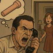
At UnitedHealthcare We’re Addressing Your Medical Expense Concerns By Ignoring You and Redesigning Our Website
We at UnitedHealthcare want you to know that we hear you, we see you, and we’re tired of you. Your own nit-picky demands are triggering the rising healthcare costs you constantly complain about, so insurance companies must remain vigilant in crafting creative non-solutions to complex issues. That’s why we’ve engineered a self-indulgent distraction that clearly shows what little interest we have in your wellbeing.
Presenting the new UnitedHealthcare website! Feast your floater-filled eyes on these adorable icons our interns grabbed from Google Images. Swaddle your worries in this blue ribbon graphic that flows freely like the three glasses of wine you guzzle daily to subdue your anxiety over the unaffordability of healthcare.
We guarantee our fresh new layout makes it harder than ever to find the information you’re looking for. Coverage options? Nah, how about a stock photo of a smiling family. Claim status? Pfft, check out this icon of a stethoscope connected to a computer. EOBs? Eeee-yeah, right, here’s another stock photo of a smiling family.
Instead of tying up health providers with your selfish medical dilemmas, have you tried typing your symptoms into WebMD and begging your loving God for mercy? Prayers don’t cost anything. Maybe try praying more and leave those doctors and nurses alone. They’re way too busy trying to navigate our labyrinthine reimbursement policies. And why does healthcare have to be all about you, anyway? You’re only making it harder for at-risk people to receive treatment for issues that have worsened because they’re reluctant to see a doctor due to their extraordinarily high deductibles.
We know you’re upset that we amassed ungodly profits during the pandemic while your premiums skyrocketed, but we also know you’re too afraid to live without health insurance. It’s like when you buy a new iPhone and it has a totally different charging cable port than every other electronic device on the planet. You’ll bitch and moan to all the other twerking weirdos on TikTok, but what will you actually do about it? Jack shit. Just accept the reality of the situation, which is that we, like Apple and the oil companies, value excessive profits over the welfare of all carbon-based life.
Paying your monthly premium only gets you access to health services that you then have to pay for in full. The extravagant revenue we accumulate from recklessly gambling with your life enables us to offer our redefined concept of “coverage” which is less of a blanket and more of a pillow you’re being smothered with à la One Flew Over the Cuckoo’s Nest (and like that story, we assume you invented your “mood disorder” to get out of work, which is why our mental health programs are inadequate and prohibitively expensive).
Whoops, our new site deleted our entire member database. You’ll have to register for a new account. Click the Create Profile icon—it’s the silhouette of a sobbing person bent over an exam table while gobs of money are surgically removed from their ass. Oh, you clicked the icon and nothing happened? That’s because our new site is just a giant JPEG that links to nothing. Click all you want, sucker. Click until your left arm tingles, but that stock photo family will keep on smiling as they watch you collapse and bleed out.
Transparency is important to UnitedHealthcare, so let us be perfectly clear: we’ve created a site that makes it so hopeless to find your account information that it’s more likely you’ll die before we have to pay you out. And when you’re dead, we won’t have to waste time pandering to your bullshit “health concerns”. That’s how we can keep costs down while we devise new ways to fuck people out of their money. It’s a big win for trickle down healthonomics!


